A
Literary Saloon
&
Site of Review.
Trying to meet all your book preview and review needs.
| Main |
 |
| the Best |
| the Rest |
| Review Index |
| Links |


to e-mail us:

support the site


Compact
by
Maurice Roche
general information | review summaries | our review | links | about the author

| Title: | Compact |
| Author: | Maurice Roche |
| Genre: | Novel |
| Written: | 1966 (Eng. 1988) |
| Length: | 157 pages |
| Original in: | French |
| Availability: | Compact - US |
| Compact - UK | |
| Compact - Canada | |
| Compact - Canada (French) | |
| Compact - France | |
| Kompakt - Deutschland |
- French title: Compact
- Translated and with an Introduction by Mark Polizzotti
- Return to top of the page -
Our Assessment:
B : creative but challenging presentation; effective -- in its hard to penetrate layers
See our review for fuller assessment.
| Source | Rating | Date | Reviewer |
|---|---|---|---|
| Publishers Weekly | . | 1/10/1988 | . |
| Die Zeit | . | 20/4/1973 | Eckart Kleßmann |
From the Reviews:
- "With Roche's method deliberately frustrating the narrative flow, Compact is not for everyone, but should please fanciers of the literary underground." - Publishers Weekly
- "Innerhalb der komplexen Topographie der strukturalistischen Systeme darf dieses Buch eine Sonderstellung beanspruchen: als eigenständiges literarisches Produkt, das die Anwendbarkeit des wissenschaftlich-theoretischen Instrumentariums der Strukturalisten in einem schöpferischen Bereich demonstriert." - Eckart Kleßmann, Die Zeit
Please note that these ratings solely represent the complete review's biased interpretation and subjective opinion of the actual reviews and do not claim to accurately reflect or represent the views of the reviewers. Similarly the illustrative quotes chosen here are merely those the complete review subjectively believes represent the tenor and judgment of the review as a whole. We acknowledge (and remind and warn you) that they may, in fact, be entirely unrepresentative of the actual reviews by any other measure.
- Return to top of the page -
The complete review's Review:
The text of Compact is visually striking, laid out in small blocks of text with as much empty space as actual writing.
At a closer first glance then it can seem as much a work of typography as of fiction, as Roche presents text in bold face, italics, small-cap, and all capitalized (and combinations thereof); beyond that, there are bits in, among other things, Braille, classical Greek, and Hebrew, as well as musical notation and words printed stretched, upside-down, along the length of the page, or strung together without spacing.
Punctuation marks are also used beyond their normal applications, and text and space are arranged across the page in a variety of ways -- far beyond the usual neat-paragraph-layout.
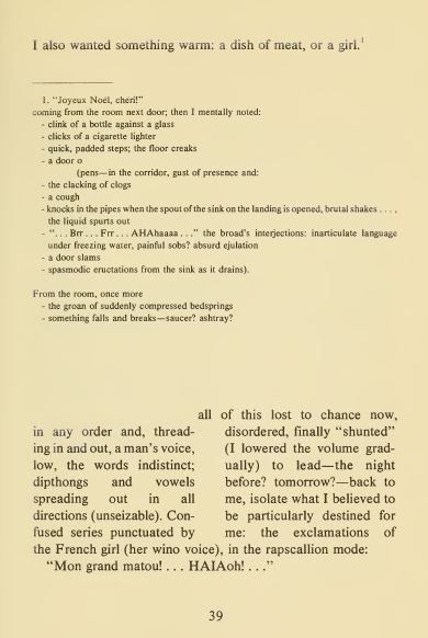
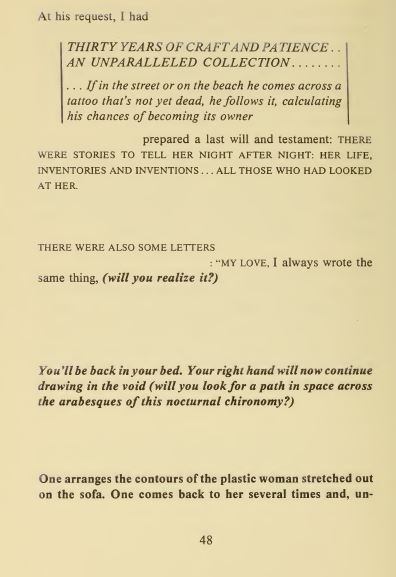
There is no 'typical' page, but you can get some idea from examples such as:
Or:
Roche even goes so far as to describe other pages and then also depict a sample:
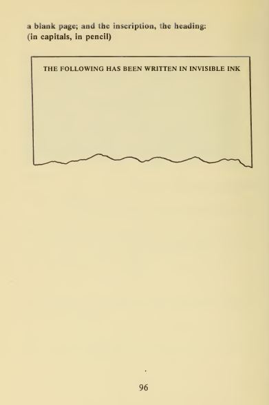
And where he can't fully (re)present his vision, he spells it out:
A THREE-DIMENSIONAL BLACK PAGE IN DEPTH-HOLLOWED OUT THROUGH OPTICAL ILLUSIONS-FOR A SPATIAL TYPOGRAPHY OF AN OUTMODED FUTURIST POEM.The typography is not solely a visual element, but rather fundamental to the narrative(s), as each variation in how the text is printed corresponds to, as translator Polizzotti notes in his Introduction: "a specific time, place, narrative thread, tense, and coloration", shifting also between first, second, and third person. (The éditions Tristram 1996 re-issue restored Roche's original approach, differentiating the threads by color rather than relying on bold/italics/all-capitals etc.; compare sample pages.) And, while the narrative can be read in the usual continuous way, each of the narrative threads can also be followed individually -- easily identifiable by the distinctive font and format --; indeed, the narrative(s) are probably easier to follow that way, since the back and forth of the text when read as is can be quite dizzying. The narrative-as-a-whole, as is, in many ways resemble a musical score -- and, indeed, there are also frequent references to music in the novel.
The result is ... polyphonic -- and reflects also the protagonist's own experience, as he describes:
(... shredded tapes of radio broadcasts came back to me in disorder: quotes—discourses—proclamations—advertising slogans—signs—new retrospectives— old news—static,Polizzotti sums up the 'story' in his Introduction:
on bits of exploded narrative. . . .)
A dying blind man lies bedridden in his Paris garret, inventing for himself voyages around the city -- which is at once Paris, New York, Papeete, and Tokyo -- and around the world. These voyages are a (usually vain) means of escaping his own enforced sedentariness, the recurrent pain of his terminal illness, and the unwanted administrations of a disquieting Japanese doctor, whose interest in his patient stems from the magnificent tattoo covering the latter's back (for the doctor is also a collector of tattooed skins). At the same time, the blind man must contend with the somewhat perverse attentions of the French girl who lives in the room next door, as well as with the haunting memories that populate the nightscape behind his eyes.But, of course, the point of Compact, far more even than in most fiction, is what the telling of the story involves (the how, more than the what) and evokes -- not merely descriptions of thoughts and actions, as well as dialogue, but a reflection of that in how it is presented. Among the effective contrasts is the great reliance on the visual in the novel -- how the text actually looks on the page -- even as its protagonist/narrator is a blind man. So also the large areas of white spaces, and the contrasts of black and white -- including blocks of it -- constantly force an awareness of the visual on the reader. Less obviously so, the text is also aural, with that secondary level of trying to present sound (obviously slightly more difficult on the printed page).
The typography is meant to mirror and reflect on the content, and Roche manages this quite well, from the simplest examples:
You'll slowlyThe protagonist's situation -- a helplessness, a reality that is often way too up close (not least in the form of the tattoo-obsessed doctor), genuine suffering -- is vividly depicted (including the memorable brief aside: "to help me doze off, I comforted myself by thinking of a means of suicide."), while the limits of even his mind-escapes are also made clear:
turn your head
to the left to the right
One feels more and more cramped as the world gets larger. you'll literally sink the night into your skull—contracting into yourself contracting—some definitive evening.Language, too, is twisted and revised to Roche's purpose, and so there is also a great deal of different wordplay in the novel. Polizzotti notes how he addressed some of this -- notably: "the 'French girl' who haunts the protagonist's sexual nightmares has here undergone a shift in nationality from her original status as an 'Americaine,' in an attempt to preserve the character's parodic foreignness (complete with funny accent)" -- and naturally has to transpose a great deal, though most of this seems to work quite well, e.g.:
Now, save for her crest of arms, I knew the wench from top to bottom . . . (thus: My nibs nibbling nimbly, in it up to my nuts—knowing that the thing was only a matter of watchamacall or thingamajig).Roche's typographical play reminds of Arno Schmidt, but whereas Schmidt is very much focused on the word-level, Roche is more concerned with the different lines of narrative -- the different voices -- in his much more musically-oriented (and 'composed') narrative -- as is also clear from the fact that the typography in Compact is, in fact, only a fall-back (made necessary by the limitations of printing in black and white), and the strands of the text were originally differentiated simply by the color of the print (making for a visually very different-looking text -- though of course Roche also plays with other aspects of typography and type-setting throughout the novel).
Noehctucsereh her escutcheon, I saw red and bawled out: "—Talley-ho! To the stakes and counter-stakes. ... To the head—flanked—to the tail!" (From sinistre to dextre) Cut slice "Give no quarter!" Sliced head (from dextre to sinistre), indeed, headed slice (according to whether I was facing, or facing he who was facing, etc. . . .)
Compact is an odd, challenging, playful text. Readers willing to invest some energy -- much, much more than straightforward prose demands -- will find considerable rewards here -- it's wild, and quite funny, and quite powerful emotionally -- but it is certainly a demanding text.
- M.A.Orthofer, 11 February 2019
- Return to top of the page -
Compact:
- Dalkey Archive Press publicity page
- Sample pages at Typographie & Littérature
- Obituary by James Kirkup
- An Evening with Maurce Roche - Q & A with Mark Polizzotti
- See Index of French literature
- Other books from Dalkey Archive Press under review
- Return to top of the page -
French author Maurice Roche lived 1924 to 1997.
- Return to top of the page -
© 2019-2021 the complete review
Main | the New | the Best | the Rest | Review Index | Links